“Color is a power which directly influences the soul.” – Wassily Kandinsky
Ever wondered why certain color combinations make you feel calm, while others energize you? It’s all about color theory, my friend! Let’s dive into the colorful world of design and uncover the secrets behind effective color choices.
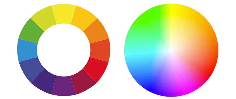
The Color Wheel: Your Artistic Palette
The color wheel is the foundation of color theory. It’s like a magical circle that contains all the colors of the rainbow.
Primary Colors: Red, Yellow, and Blue are the building blocks of all other colors.
Secondary Colors: Orange, Green, and Purple are created by mixing two primary colors.
Tertiary Colors: These are created by mixing a primary color with a secondary color.
Color Harmony: The Art of Color Combinations
Color harmony is the secret sauce to visually appealing designs. Here are some common color harmony schemes:
Complementary Colors: These are colors that sit opposite each other on the color wheel. They create high contrast and visual excitement.
Analogous Colors: These are colors that sit next to each other on the color wheel. They create a harmonious and soothing effect.
Triadic Colors: These are three colors that are equally spaced on the color wheel. They create a vibrant and dynamic look.
Monochromatic Colors: These are different shades, tints, and tones of a single color. They create a sophisticated and elegant look.
Color in Digital Design: A Digital Palette
In the digital world, color is often expressed using different color models, such as RGB and CMYK.
RGB: Red, Green, and Blue are the primary colors in this model, used for digital displays.
CMYK: Cyan, Magenta, Yellow, and Black are the primary colors in this model, used for printing.
Tips for Using Color Effectively
Start with a Mood Board: Create a visual mood board to help you define the overall color palette for your project.
Use a Color Palette Generator: Tools like Adobe Color can help you create harmonious color palettes.
Test Your Colors: Print out your designs to see how the colors look in different lighting conditions.
Don’t Overdo It: Too many colors can be overwhelming. Stick to a limited color palette.
By understanding the basics of color theory, you can create visually stunning designs that captivate your audience. So, go ahead, experiment with color, and let your creativity shine!
Image Courtesy: Complementary Colors Vectors by Vecteezy Infographic Vectors by Vecteezy Triadic colors Background Vectors by Vecteezy