Ever felt like your designs were as flat as a pancake? Or maybe your color palette was as clashing as a polka-dotted leopard and a zebra? Don’t worry, you’re not alone! We’ve all been there. But fear not, fellow designers, for we’re about to dive into the magical world of graphic design elements and learn how to turn your bland creations into visual masterpieces.
Let’s start with the basics:
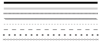
Line: Think of lines as the skeleton of your design. They can be straight, curved, dotted, or dashed. They can create a sense of movement, direction, and even emotion. For example, a wavy line can evoke a feeling of calmness, while a jagged line can convey chaos. Just remember, too many lines can make your design look like a spider web.
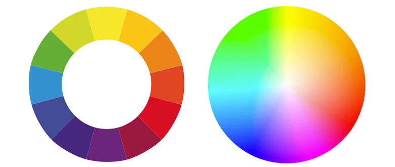
- Color: Color is the lifeblood of any design. It can evoke emotions, create mood, and even influence perception. For example, red is often associated with passion and energy, while blue can symbolize trust and reliability. But remember, too many colors can make your design look like a clown’s face.
- Size: Size matters! The size of elements within your design can affect their visual hierarchy and emphasis. Larger elements tend to draw more attention, while smaller elements can create a sense of subtlety. Just remember, if everything is big, nothing is big.

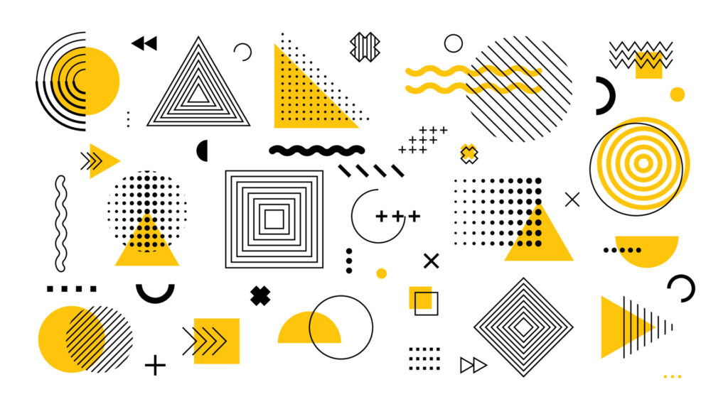
- Shape: Shapes are the building blocks of your design. They can be geometric (squares, circles, triangles) or organic (irregular forms). Shapes can convey specific meanings. For example, a circle might symbolize unity, while a triangle can represent stability. Just remember, too many shapes can make your design look like a jigsaw puzzle gone wrong.
- Direction: The direction of elements within your design can influence how viewers perceive movement and flow. Horizontal lines suggest stability, vertical lines imply growth, and diagonal lines create a sense of dynamism. Just remember, if everything is going in the same direction, your design might feel a bit one-dimensional.
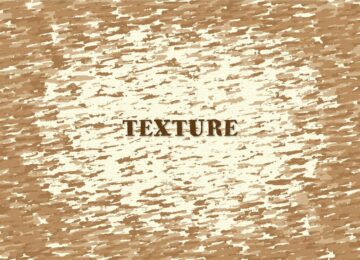
Texture: Texture adds depth and interest to your design. It can be physical or visual. Think of texture as the skin of your design. Just remember, too much texture can make your design feel rough and uncomfortable.
Now that you have a basic understanding of the elements of design, it’s time to put them into practice. Remember, the key to creating effective designs is to use these elements in harmony. Don’t be afraid to experiment and have fun! And most importantly, always strive to create designs that are both visually appealing and meaningful.
As a graphic designer, it’s also important to remember your ethical responsibilities. Be honest, transparent, and respectful in your work. Avoid plagiarism and copyright infringement. And always strive to create designs that are inclusive and accessible to all.
So, the next time you’re feeling stuck in a design rut, remember these elements and have some fun with them. With a little creativity and a lot of practice, you’ll be creating stunning designs in no time!

